A Design Review of Newspapers' Websites Based in Imphal
The reason could be glaring to the professional web designers, but it is hard to understand for the layperson. But the fact is that these newspapers have the worst website design anyone can think of. This is not really a criticism but a few thoughts I have all the time.
It may be too much for the presses in Imphal — possibly low salary, work pressure, external forces like they have always faced from commando bully or to publish news or perish as dictated by the militant groups — however it goes without saying if there is ever a poll for the worst news website design, we have some of the potential links we can vote for, from our own backyard. Precisely this has nothing to do with work pressure or terrorism. One of the most awkward elements is the missing main news in every website. This is a blunder. In fact every element, on each website, is not easy on the eye. But I saw it today, for the first time, in the People's Chronicle. (This paper was just started in September last.) In fact, its design prompted me to write this post after all these days of tolerating with the 1990s, blog layout styles all along. The People's Chronicle has the main news now. What a relief!
I'll leave the verdict to the readers. How much is the Chronicle different from others? See for example, its colour combination of light crimson, red, grey and a patch of cyan to highlight it's the English edition of Poknapham. The combination looks as matching as the scent of Davidoff Cool Water with the cold season of yongchaak. With little explanation for the defective and ugliest design that some of these newspaper websites have, there has to be some compensation. So if it is conceptually wrong, the only thing we can look forward to these websites are their well-written editorials and articles, provided if there are any such write-up. Check the editorial styles some other time. Seeing the present situation in the state, I prefer them to be based on antiestablishmentism but I'm not sure if they really are.
Only their publishers and the designers know why some of these most-read papers in the shanty town of Imphal have such silly errors and their websites are still badly designed on themes based on those 1990s layout with no sense of aesthetics at all.
Most of the time, I feel it's not about the money, but ignorance and lack of aesthetics that make these websites an eye sore. The sympathy is for the professional web designers who have ruthlessly built the websites' various parts.
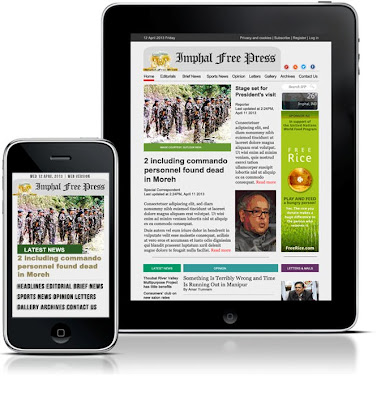
The masthead of the Sangai Express has pixellated letters, a vulgar outer stroke and shadow, plus an offensive font combination. The Imphal Free Press is better in these areas, but its layout is no different from a humdrum blog design. In short, all of them look so unprofessional. Anyone who knows the basics of Adobe Photoshop and Dreamweaver can easily design this type of ugly layout. It is such a disaster in every site you landed in late night or early in the morning. The Imphal Free Press and the Sangai Express are usually updated around 1:30-2:30AM; and then in the next morning, the IFP's stories go to Kangla Online portal, while the Sangai's go to E-pao. The newspapers' sites are updated only once a day. Hueiyen Lanpao, which can be equally grouped with these few websites, is not featured here but its news and views also go to E-pao. Come on, these are the days of HTML5 and Flash. It's only about some improvement and appreciation of aesthetics, not in a sense of overall renovation of the websites, tweaking here and there to amend the defects.
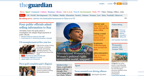
See the New Yorker, for example, of course it's not a newspaper' site, but for an indication they use the bland Times New Roman for the body text yet they look so superb. Both the Imphal Free Press and the Sangai Express use Trebuchet. Most notably, the editorial headline in the Sangai Express is a sucker. In the print version there are two heads, but these are combined in the web version with no separation. Atrocious! How can they even let it go all the time? For inspiration, there are a lot of news websites. The Guardian is very colourful and every section is divided properly with no clutter at all. Earlier this month, this paper announced that they will stop publishing the traditional newspapers and will be 100% online from Jan 2013.
Another notable site, closer home, is the Hindu, with its neat and clean design elements. There are a lot of other examples for inspiration (we can start from these links: http://www.onlinenewspapers.com; http://www.world-newspapers.com; http://www.newslink.org). It is not necessarily a comparison of the local websites and international-level newspapers but finding the rooms for improvement. A comparison can be done for the editorial quality for sure, yet again, the websites are just for a sense check, which has nothing to do with the layout design and typography. It is not hard to conclude why the news sites are wide open calling for troubles. I wish in the days to come, these insipid websites will get rid of their design suicidal tendency.
Courtesy:
>> http://www.ifp.co.in/ >> http://www.thesangaiexpress.com/ >> http://thepeopleschronicle.in/ >> http://www.thehindu.com/ >> http://www.guardian.co.uk/
The screenshots were taken on 8 March 2013


The Sangai Express is a very popular news agency of Manipur. The Sangai Express publishes news of Manipur in English and Manipuri languages. Click for today's Sangai Express newspaper from Imphal, India. Book Advertisement in Sangai Express Newspaper at low price best deal for advertising. via myadvtcorner
ReplyDelete